Company Examples for Chapters 9 and 10: Data,Visuals, and Reports
United Airlines Reports on Incident When Man Is Dragged Out the Plane (April 2017) 
Most air travelers have seen the video of Dr. Dao being removed from his seat and dragged down the aisle of a United flight. In response, the airline published a report, changed its policies, and disseminated messages by email, video, Twitter, and its website. The report has many headings and bullets, so it's a good example for organization, although it's far from perfect. Additional links are in this post, and students may find it interesting to compare the email, web statement, videos, and reports. United did a good job distinguishing each of these.
Melania Trump's Plagiarizes Michelle Obama's Speech (July 2016)
I can't resist this one from the Republican National Convention to illustrate plagiarism. This post includes a transcript comparison, and here's the video comparison.
This is an example from Trump Institute, but these may be too much to discuss in one class.
Penn State Analyzes Airbnb Data (May 2016)
A Penn State University report shows the "other side" of Airbnb. The report uses simple graphics and makes a simple argument. You may want to contrast the Penn State report with a government report like this one: The World Economic Forum's report on Global Competitiveness.
FDA Changes the Nutrition Label (May 2016)
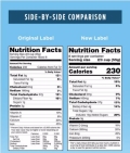
 For the first time since the early 1990s, the Food and Drug Administration updated the nutrition label that appears on packaged foods. The agency is proud of the change, calling it a "major step." Michelle Obama was part of the process and is quoted in the FDA's press release: "This is going to make a real difference in providing families across the country the information they need to make healthy choices." I'm skeptical.
Law Schools Inflate Placement Data (March 2016)
The spin on law school data is a bit depressing but is relevant to students who plan to apply. I have very few students who go on to law school, but I could see using the data in a scenario where students choose a school and develop a slide or two for recruiting purposes. Where do they draw the ethical lines?
Gapminder Uses Creative Visuals
Gapminder is my favorite site for showing the beauty of data. The interactive bubble charts and "Dollar Street" images give students ideas for visualizing information in new ways. Also explore Hans Rosling's TedTalks on YouTube.
Older Examples
Financial snapshot and downloaded data for Sara Lee. Useful to discuss converting data into an annual report.
The Fair Trade Almanac is packed with interesting data and charts. (Select "Fair Trade Almanac.)
Terrible example of an infographice: Does Texting Hurt Your Grammar?
Good example of an infographic, by PETA: PETA Saves.
Taco Bell's visual describing their beef.
Google's data-filled response to anti-trust charges, 2015.
Columbia University's report about Rolling Stone's article about campus rape, the article author's apology, and the University of Virginia's statement. 2014.
Gates Foundation Next Generation request for proposal. Read more about the program here.
Comcast request for proposal for research/design. Simple PowerPoint format.
British Columbia Lottery Corporation request for proposal to change gambling incentives. Traditional report format.
Expedia's innovative report format sent within an email.
Collection of sustainability reports.
Two versions of Walmart's 2011 annual report: PDF format and website. Also, here's Walmart's "Global Responsibility Report." Useful to compare the three for different formats and audiences.
Sara Lee's annual report.
Report about engaged brands using social media (referenced in Chapter 3).
Sharp announces job cuts and plans in two reports: First-quarter 2012 release and presentation.
Apple's 2012 supplier responsibility report.
PR/Communications best practices report.
Government 2014 climate change report.
Facebook's creative annual report.
Leaked New York Times report about the company's innovation.
Investor PPT report about Darden Restaurants, 2014.
The Pope encyclical on the environment, 2015.
Educause research on students' use of technology.
Fabulous Ted Talk by David McCandless on different ways of visualizing data.
Comparing cup sizes in the movie Super Size Me (download). Useful for discussing data analysis and creating charts (Scene 7, 19:48 – 21:12).
Video demonstration of Gapminder World by Hans Rosling. Useful to show interactive displays of data. Here is Rosling's Ted Talk.
Sloppy charts that students can analyze and perhaps redraw.
Terrible infographic that students can analyze and perhaps redraw.
Another cute infographic with no clear audience or point.