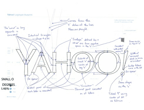
Yahoo's New Logo
For the first time in 18 years, Yahoo has a new logo-still purple and still sporting that question mark I never know whether I should include in writing. (I recently dropped it, following The New York Times' practice.)
In this video, you'll see many logo variations that the company considered.
In a blog post, CEO Marissa Mayer described the redesign process:
"So, one weekend this summer, I rolled up my sleeves and dove into the trenches with our logo design team: Bob Stohrer, Marc DeBartolomeis, Russ Khaydarov, and our intern Max Ma. We spent the majority of Saturday and Sunday designing the logo from start to finish, and we had a ton of fun weighing every minute detail.
"We knew we wanted a logo that reflected Yahoo - whimsical, yet sophisticated. Modern and fresh, with a nod to our history. Having a human touch, personal. Proud."
Sounds like fun. But the changes are subtle, rather than dramatic.
Discussion Starters:
- Compare the new logo to the old one. What differences do you notice, and what significance do they hold?
- Read Mayer's summary of the decisions made. Did you catch all of the changes and see the significance of each?
