More Than You Want to Know About Fonts
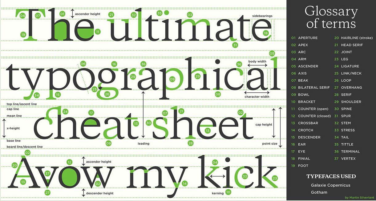
 This may be more than mere mortals and business writers need to know, but typography is interesting. We often use default fonts that Microsoft chooses for us, but this graphic shows the many variables among them.
The most commonly known term is probably serif, shown here as 28 on the third row. The letter h in this font has small lines at the bottom. These "legs" are missing in sans-serif fonts, which means they are "without" them. Serif fonts include Times New Roman, Garamond, and Georgia (this one), while standard sans-serif fonts are Arial and Calibri.
Fonts can reflect a company or style of writing. Disney and others have their own special fonts, which could be fun for headings but may be too much for body text. People are long tired of Comic Sans, which is cute for K-12 documents but little else. Serif fonts tend to be more formal looking, while sans-serif are more informal.
Although presenters get creative in choosing fonts, a common problem is using a font that isn't installed on another computer. For example, you create a PPT file on one computer, but when you open the file on another and the font isn't available, the new computer will choose a default. This messes up alignment because the two fonts may be different sizes. More specifically, from the glossary at right, the character width, ascender height, or x-height may be different.
Some fonts are wholly unreadable and should be avoided entirely. Impact, for example, should be used sparingly for large headings only.
Discussion:
- Do you have a favorite font? What do you like about it?
- Have you tried different fonts for different purposes? How did it turn out?