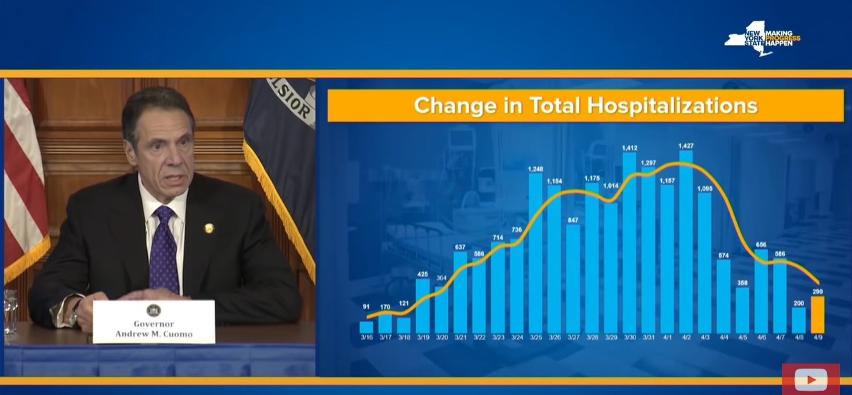
Misleading NY Covid-19 Chart
Thanks to Carl Quintanilla for posting this example of a misleading chart. New York Governor Andrew Cuomo has been lauded for his leadership during the coronavirus crisis, yet critics say one of the mainstay charts in his news conferences shows a skewed story.
When he shows this chart, Governor Cuomo describes, the decreasing numbers of new hospitalizations. The chart title is clear: “Change in Total Hospitalizations.” But what does the visual imply?
Similarly, he shows “Change in ICU Admissions” (approx.00:35 in the video).
Discussion:
Watch the first minute of the news conference. Is he clear, or could he be clearer in his explanation?
What’s your view of the two charts? Are they misleading? What are the possible consequences of showing the data in a misleading way?
How, if at all, should these charts be changed?

