This Week’s Charts

A Wall Street Journal article includes a few simple data slides about people losing and finding jobs. The first line chart, shown here, is a good example of an at-a-glance picture of the employment rebound. The second chart, below, takes a bit longer to digest but provides more information. Both do what graphics should do: illustrate relationships of data to provide insights.

This Bloomberg image about SoftBank’s “epic losses” made me smile. I used the bank’s vague, data-less graphics as examples in Chapter 9 of Business Communication and Character. But in those SoftBank slides, one of which is below, the arrows pointed up, showing the bank’s overly optimistic view of WeWork.

"Woke" Report for Medical Colleges

The Wall Street Journal editorial board criticized an Association of American Medical Colleges (AAMC) report as “woke” because it identifies diversity, equity, and inclusion (DEI) competencies for future doctors. A draft copy of the report shows recommendations for students, residents, and faculty.

Competencies include what you might expect for medical professionals, for example, advocating for diverse health care teams, mitigating biases, eliminating inequities, and practicing anti-racism. Although typical for encouraging DEI practice in any profession, the WSJ editorial board has harsh words for the report:

The woke domination of American higher education can seem tragically comic when it’s confined to the English department. But when it infiltrates the hard sciences, far more is at stake. Read and wince at how woke politics is about to infect medical education.

Business communication students can analyze the report purpose, structure, and style—and the opinion letter as an example of persuasive communication.

Data Visualizations with Pop-Up Text

An NBC data visualization packs in a lot of data at-a-glance. With a simple table format and color, the graphic shows inflation for items over time. The chart is a good example of an alternative to the boring line and column or bar chart.

Later in the article, NBC does include two line charts, which work fine for more simple data—trends of single variables over time. But inflation is complicated, driven by key sectors, which this graphic illustrates.

The pop-up (hover over) text makes it easy to zoom into the data and add interactivity to graphics. Pop-up text functionality has been available in PowerPoint and Excel for years, and it’s easy to use. This feature add layers to data visualizations and can be effective for slide decks that people read on their own or for presenters to highlight important data points.

Argument Linking Marijuana to Violence

A Wall Street Journal opinion is a good example of a persuasive argument for business communication students to analyze. The articles uses logical arguments, emotional appeal, and credibility; evidence is stronger for some points than for others.

The author provides research to support increased marijuana use in young people and to link marijuana use to mental illness and hospital visits. Is the evidence linking use to violence strong enough to convince students? The first study referenced studies of teenagers with mood disorders; the second is a meta-study that concludes, “cannabis use appears to be a contributing factor in the perpetration of violence.” Both are from credible sources and illustrate data analysis principles from Chapter 9 in the text.

I find the article title, “Cannabis and the Violent Crime Surge,” a misleading stretch. Coming just days after an elementary school school shooting—and when gun violence is a news mainstay—the WSJ implies a conclusion that I don’t see in the evidence. The author uses an example as evidence: the Uvalde, Texas, shooter apparently had a history of smoking marijuana. In addition, the argument is complicated by the claim that the shooter was NOT smoking at the time. Yet, he could have been experiencing detox, which may include anger and irritability. The author doesn’t include these points.

The author ends with, “Maybe it’s time that lawmakers and voters rethink their pot-legalization experiment before more young lives are damaged.” Do students agree?

Image source.

McKinsey Testifies About Role in Opioid Crisis

McKinsey’s managing partner testified about what the U.S. Oversight Committee considers a conflict of interest and issue of integrity: consultants worked for drug manufacturers like Purdue Pharma while working for the federal government. Several communication examples illustrate business communication principles:

The Committee’s full report, a 53-page analysis of the situation

The Committee’s press release about the hearing, which includes a summary of the report

Both persuasive communication examples use descriptive message titles throughout the report and provide evidence under each claim. The claims (main points) focus on McKinsey’s questionable actions, particularly how its private and public work may have influenced the other and how the company may have failed to disclose conflicts of interest.

Testimony during the hearing also illustrates persuasion communication. Here are two examples:

  • Jessica Tillipman, Assistant Dean for Government Procurement Law Studies, George Washington University Law School    

  • Bob Sternfels, Global Managing Partner, McKinsey & Company    

In addition to integrity, as Carolyn B. Maloney said in her opening, this situation is also about accountability and humility. Of course, compassion is a subcurrent throughout, with several impassioned comments about the toll of opioids, including Fentanyl.

Marimekko Chart Showing U.S. Aid to Ukraine

A New York Times graphic shows U.S. spending on the Russian war on Ukraine. The display is a Marimekko chart, a visualization of multiple data sets—an at-a-glance picture of a lot of data. In this case, the chart groups data and assigns colors to show traditional foreign aid, military supplies, military deployments and intelligence, and sanctions and other aid.

Although this chart is often called a Marimekko, or Mekko, this article author would call it a treemap because data isn’t displayed in all boxes, and we don’t see columns that add up to 100. I don’t find the distinction important, but the article is useful to see several ways to create a Marimekko chart. Perhaps the easiest is to select, within Powerpoint, a treemap as your chart type.

Data in Domino's TV Commercial

To fill work hours, companies are getting creative about recruiting. Domino’s, FedEx, and other companies are running commercials on TV and using social social media influencers to drum up applications.

The Domino’s ad features an employee who rose through the company ranks to become a franchise owner. She seems “relatable,” we say these days, so viewers can picture themselves working at Domino’s and maybe having the same success. Surprisingly, she is only 27 years old.

The company touts data: “95 of our franchisees started out as delivery drives or store employees.” That sounds impressive and potentially inspiring. But I want to know what percentage of drivers and store employees have become franchisees? Also, the commercial omits important information about the investment costs. Fees vary by store, but could range from $145,000 to $500,000, and a net worth of $250,000 may be required. Still, maybe the ad works to recruit new employees? I wonder.

Misrepresenting COVID-19 Study Findings

A study about COVID testing in schools is criticized for its authors’ conclusions. Researchers at Duke, in collaboration with the North Carolina Department of Health and Human Services, studied the “test-to-stay” approach for schoolchildren. With this approach, if a child tests negative after being exposed to someone who tests positive, that child can go to school. Researchers found this strategy to be effective in getting kids back to school—without increasing COVID transmissions.

The trouble, described in a Wall Street Journal opinion piece, is that authors concluded, “in schools with universal masking, test-to-stay is an effective strategy.” The writers explain their thinking:

“That invites readers to assume that test-to-stay doesn’t work without forced masking. But since they studied no unmasked schools, this conclusion is baseless. An honest report would either have said so or not mentioned masking at all.”

The writers believe that study authors are pushing their own agenda for schools to require masking. This is a good example of a study interpretation that is technically correct but omits important information for a fair comparison. In such cases, researchers might hurt their own credibility. On the other hand, do people assume, as the writers say, that “test to stay” doesn’t work in schools without mask mandates?

Visualizing Big Numbers

President Biden’s “Build Back Better” infrastructure plan may be difficult to visualize. When we consider trillions of dollars, traditional business charts—bars, pies, and lines—may not be the best choice.

Here are a few visualizations to compare:

These aren’t perfect comparisons because they cover different categories and are from different points in time, but they do give us options to help audiences understand data. What other visualizations can you find, and which are most effective for what purpose?

Overblown Generational Differences

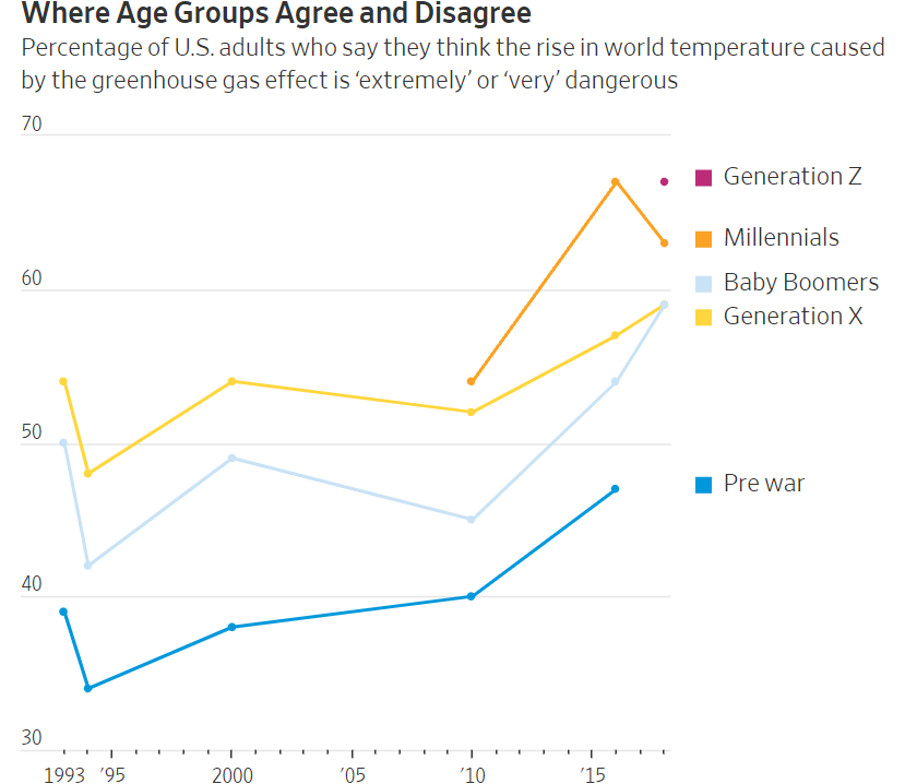
Finally, a mainstream article, “The Bunk of Generational Talk,” describes exaggerated differences among age groups. Categorical thinking contributes to imagined “gaps” and tropes. With random year divisions, naming generations only reinforces stereotypes.

The article author, a professor of public policy, provides research showing that most differences among generations are driven by factors other than generation alone. For example, beliefs about climate change have tracked fairly closely over time. He summarizes the issue well:

“Our wrongheaded thinking about generations leads us to focus on the wrong problems. Headlines about spendthrift young people, for example, distract us from the huge shift in economic policy in recent decades toward the interests of older people. We avoid facing up to a challenge like climate change by laying the blame on older generations while placing our expectations for salvation on the coming generation. Across a range of issues, manufacturing fake generational battles denies us the benefits of intergenerational connection and solidarity.”

Business Communication and Character describes ways to work and communicate across differences—not invent differences to mock and scorn.

Failing Data Analysis in the Theranos Trial

The criminal trial against Theranos Founder and former CEO Elizabeth Holmes now focuses on testimony from Safeway, Walgreens, and Johns Hopkins University. Questions involve how these companies evaluated Theranos’ blood-testing technology and concluded that it was sound when, in fact, results was consistently false.

At this point in the trail, investors blame Holmes, whose defense is that the companies did due diligence and are responsible for their decisions. A Wall Street Journal article about the arguments highlights the companies’ and the university’s failings and over-reliance on Holmes’ claims.

As the relationship between Safeway and Theranos progressed, CEO Steve Burd wrote an email to Theranos with the subject, “Becoming Discouraged.” He testified, “I think whenever you start something new you’re going to have some rough spots, but we continued to have rough spots. We had samples that were lost. We had results that didn’t make any sense.”

We’ll see how the trial evolves, but clearly, experts needed to ask more questions up front. In some cases, they didn’t test the actual technology themselves. This story is a good example of failures in integrity and data analysis—perhaps for many involved.

Facebook Responds to President Biden's Criticism

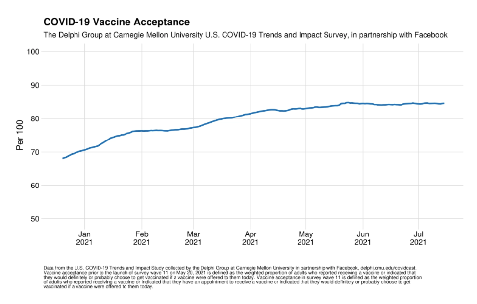
Facebook is on the defensive after President Biden said the company is “killing people.” The president blamed Facebook for not managing misinformation about the COVID-19 vaccine and, as a result, causing more deaths: “Look, the only pandemic we have is among the unvaccinated. And they’re killing people.”

FB Vaccine.PNG

President Biden later softened his message, saying that information from about a dozen people is wrongly influencing people’s decisions: “Facebook isn’t killing people; these 12 people are out there giving misinformation. Anyone listening to it is getting hurt by it. It’s killing people. It’s bad information.”

In response, Facebook published a statement on its website, “Moving Past the Finger Pointing.” The writer, Guy Rosen, VP of Integrity, offers several points of evidence. He mentions partnerships with universities, the high vaccination rate among Facebook users (85%), and measures the company has taken, including promoting “authoritative information” and labeling “debunked” content.

Rosen disputes what is perhaps President Biden’s implied claim: that Facebook is the reason he missed his goal of having 70% of Americans vaccinated by July 4.

A New York Times Daily podcast analyzes the arguments and finds strengths and weaknesses on both sides. The reasons people don’t get vaccinated are complicated. At the same time, the reporter concludes, Facebook could do more to prevent the spread of misinformation.

This story is a good example of persuasion—and politics and business.

More Hope for Email’s Demise

A hopeful New York Times article surmises that Gen Z will save us all from email. The subtitle sums up the sentiment:

“It’s actually crazy how outdated it is.” People born after AOL Mail was invented seem to prefer to communicate in almost any other way.

The article cites a study that describes the many collaboration tools employees use every day—tools from different companies that aren’t necessarily sanctioned by their organization. An employee might use Google Docs, Zoom, Apple iMessage, and Microsoft PPT or some other combination of products. This chart shows what tools people under 30 use more frequently.

One 24-year-old said she uses “literally anything but email” when given the choice. Email is viewed as a cause of stress, particularly having to check it often and because it often means task delegation: an email brings something that needs to get done. Because email takes time away from other tasks, employees also feel interrupted, and research tells us people need about a minute to get back on track.

A FastCompany writer hypothesizes that the younger generation might finally kill email, and iMessage, rather than Slack or Microsoft Teams, might be the bullet. I’m skeptical, but like these articles, I remain hopeful. Being older, I don’t have the emotional baggage of email because that’s how I grew up. But I understand the grace and simplicity of Apple tools and welcome them at work.

Clear Line Charts

Tax 2.PNG

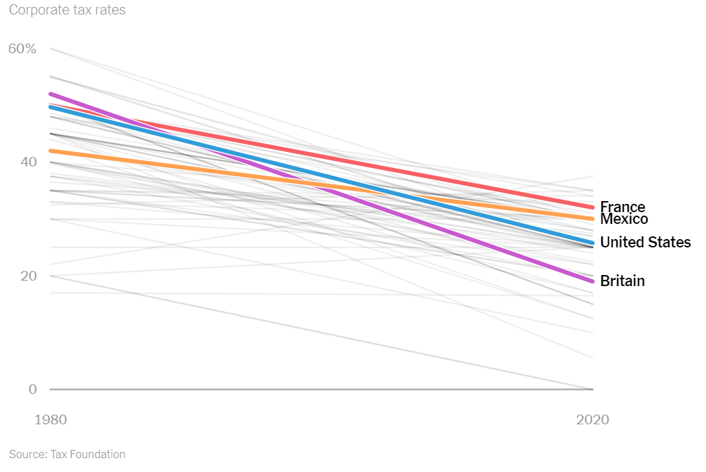
A New York Times opinion article illustrates the power of the line chart. With the title, “This Is Tax Evasion, Plain and Simple,” the author describes the U.S. corporate rate over time and compared to other countries.

The authors argue that countries have reduced corporate rates to compete for businesses, and over time, the rate has become too low. The chart at right compares the U.S. to other countries, while the chart below shows the change in U.S. wage and corporate taxes since 1950.

Tax 3.PNG

Additional charts show that companies have moved money to tax havens abroad, but economies and workers have not benefitted.

An economist and a writer and graphics editor paired up to produce the article. We see the influence of both—the data, plain language, and charts paint a vivid picture.


AstraZeneca's Data Problems

AstraZeneca has been accused of presenting “outdated and potentially misleading” data about the vaccine that has suffered implementation trouble in Europe. In a press release and a CNBC interview with the president, the company reported a 79% effectiveness rate, despite later results between 69 and 75%.

A group of independent experts wrote a letter to U.S. government officials to express their concern, as The Washington Post reports:

AstraZeneca.jpeg

The DSMB is concerned that AstraZeneca chose to use data that was already outdated and potentially misleading in their press release,” the letter states. The data “they chose to release was the most favorable for the study as opposed to the most recent and most complete. Decisions like this are what erode public trust in the scientific process.”

The company promised a review: “We will immediately engage with the independent data safety monitoring board to share our primary analysis with the most up to date efficacy data.” But damage is already done.

The Washington Post explains, “But it appears to be the latest in a series of self-inflicted wounds from the team behind the vaccine, which has had months of stumbles involving messy science and bungled communication.”

This latest misstep only complicates a possible U.S. rollout and breeds more skepticism in those who fear the vaccine. Fears in some populations, such as Black Americans, are based on understandable mistrust of the healthcare system, and this news will not likely inspire more participation in plans for herd immunity.

As an issue of credibility, AstraZeneca is caught in a public quagmire. What might have been a small misstep is now viewed as part of a larger, potentially intentional plan to deceive, whether or not that is true. The company’s integrity is in question because they have not been fully transparent about the vaccine results.

Image source.

Fauci: "Numbers Don't Lie"

Dr. Anthony Fauci, the lead infectious disease expert in the U.S., was asked whether the nation has the worst COVID outbreak, and he said, “Numbers don’t lie.”

CNN’s Dr. Sanjay Gupta interviewed the doctor at a Harvard School of Public Health forum. Dr. Gupta asked, “We're not quite 5% of the world's population, yet represent 20-25% of the world's infections ... I mean, that has to be the worst. Is it not the worst?" 

Dr. Fauci responded, “Yeah, it is quantitatively if you look at it, it is. I mean the numbers don't lie.”

The doctors are looking at infections per capita. Of course, we could look at other measures. In this interview, President Trump considers the number of deaths as a percentage of those infected.

Discussion:

  • Do numbers lie? Can they? What about this book: How to Lie with Statistics?

  • Find evidence to both support and dispute the claim that the U.S. is the “worst.” What measures can you find? Which do you find more meaningful?

Should I Go Outside? A Visual

Researches created a visual to help people make informed decisions as communities re-open during the pandemic. The group has a consulting firm that helps organizations assess risk, and the visual is a representation of their work.

The COVID-19 Risk Index uses color coding to identify the likelihood that you’ll contract the virus during various activities, such as visiting the hospital, grocery shopping, or going to the dentist (which I did yesterday).

Covid Risk Index.PNG

Discussion:

  • How effective do you find the visual for helping you assess risk? On what criteria do you base your analysis?

  • What, if anything, is missing from the index? How could you adapt the tool for local regions?

Motion Charts

A New York Times article, “What Does Opportunity Look Like Where You Live?,” includes motion charts depicting life expectancy, commute times, and other variables across the U.S.

Although imperfect, the charts show changes over time. The movement is an effective way to dramatize differences between groups, as Gapminder has done with UN data for years.

Income.PNG

Discussion:

  • The bubbles move when they are first loaded on the page, but I can’t seem to “interact” with them the way I expect to with an “interactive graphic.” What did you expect? Could these be improved?

  • Some charts have a truncated axis; for example, one about life expectancy starts at 60. What are the implications, and should this be avoided?

  • What, if anything, surprises you about the data presented?

COVID-19 Crisis Communication for Reopening the U.S.

CIDRAP quote.PNG

What comes after we “flatten the curve” of COVID cases? New York Times opinion writer Charlie Warzel warns that, without a clear communication strategy for what’s next, people will distrust leaders.

Warzel cites six communication guidelines from the report of a working group at The University of Minnesota, The Center for Infectious Disease Research and Policy (CIDRP).:

  • Don’t Over Reassure.

  • Proclaim Uncertainty

  • Validate Emotions—Your Audience’s and Your Own

  • Give People Things to Do

  • Admit and Apologize for Errors

  • Share Dilemma

Discussion:

  • How should U.S. officials communicate now? What do they need to accomplish, and how well are our current leaders meeting the challenge? In other words, do you agree with Warzel that our leaders are falling short?

  • Read the entire report. What other principles does the group recommend?

  • Analyze the report: the audiences, objectives, writing style, organization, and so on. What are the strengths, and how could it be improved?

Similar COVID-19 Ads

Are all COVID-19 ads the same? A digital marketer compiled excerpts from recent ads showing similar images, music, and phrases. He titled his video, “Every Covid-19 Commercial Is Exactly the Same.”

Sean Haney describes why so many ads are the same:

Layoff messaging.PNG

What's the deal? In reality, many companies have found themselves short on cash, almost overnight. They needed to get a message out - and quick. They asked their teams to throw something together. Since they can't film a new ad because of social distancing, they compiled old stock b-roll footage and found the most inoffensive royalty-free piano track they could find. This, combined with a decade of marketing trends dictated by focus groups and design-by-committee, released a tsunami of derivative, cliche ads all within a week of one another. It's not a conspiracy - but perhaps a sign that it's time for something new.

A Morning Consult report offers guidance for companies. From 2,200 Americans at the end of March, we learn how companies should communicate. For example, people say they are more likely to purchase from a company that provides “a public statement about support being given to laid-off employees” compared to other types of statements.

Discussion:

  • What’s your view of these company ads? How do you react when you see them? Do you react differently to different companies’ ads?

  • Read the report. Analyze the audience, objectives, tone, organization, visuals, and so on. What principles of business communication are followed?

  • What else do you learn from the report about how companies should communicate during COVID-19?