Data Visualization as a "Discipline"
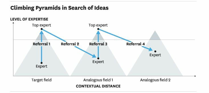
/A Harvard Business Review article reminds us to focus on our message when visualizing data. Author Scott Berinato suggests asking ourselves two questions to start:
- Is the information conceptual or data-driven?
- Am I declaring something or exploring something?
Berinato then identifies four types of visual communication: idea illustration, idea generation, visual discovery, and everyday dataviz. For idea illustration, he offers a weak and an improved example. You'll notice that the first includes elements of "chart junk" that detract from the message.
- How does Berinato's second example illustrate principles from Chapter 9 in the text book?
- Consider a message you need to communicate. How does this article help you decide what visuals would support your points?


