Creative Charts
/  Business Insider gathered up a few Apple charts they call "eye popping." Some are useful and well done, while others are pretty but confusing.
This first one, by Ishtyaq Habib, is beautiful but impossible to read at a normal size. Zoom in five or six times, and you can read that these are company representations. Color coding by industry is clever, but why aren't they grouped together? Profit as the internal circle and revenue external is also clever, but the scale is so small. I imagine this as a terrific poster.
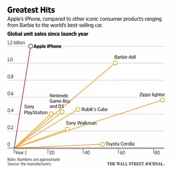
Next is a Wall Street Journal line chart comparing Apple sales to other products. It's clear and easy to read.
A WSJ stacked bar chart is also well done. As percentages of a whole, the chart shows the comparisons by year clearly. The title is cute-"slide of the pie"-but may not be appropriate for business audiences. Also the colors are pale and babyish. I'm not sure why these were chosen, and I wonder whether people who are color blind would have a problem distinguishing the pink and blue next to each other.
Discussion:
- What do you think of these charts? Look at the Business Insider article for more. Analyze them against principles from Chapter 9.
- How could the color bubble chart be improved? The concept is great; it's just unreadable.


