Creative Charts
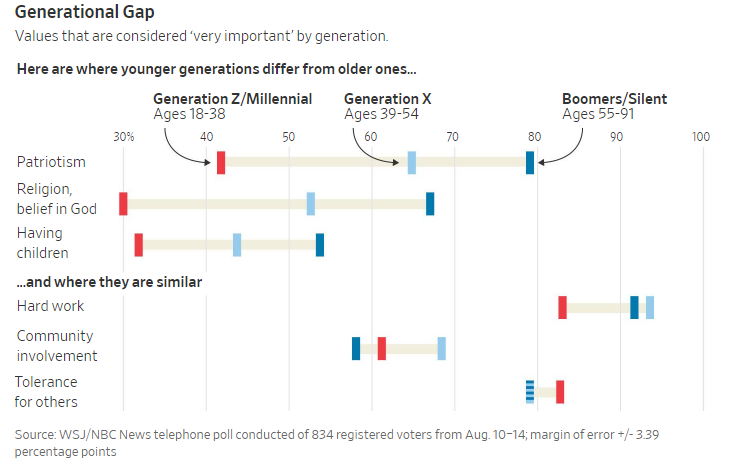
/The Wall Street Journal created a chart to show what Americans value—and how those values have shifted over time. The graphic is a variation on a line chart with generations represented by color.
Understanding the chart may take a while. At first glance, the generation identifiers at the top look like headings, but they point to small bar colors.
The information is interesting, and some points probably aren’t surprising. Older Americans value patriotism, religion (which the poll describes as “belief in God”), and having children more highly than do younger Americans.
Discussion:
Assess the graphic design. How intuitive do you find the chart? What works well, and what could be improved?
What are your reactions to the data? What do you find surprising—and not?
What implications do you see for companies’ attempts to keep employees engaged at work?


