Darden and Ruth’s Chris Acquisition Announcement

Darden’s announcement about buying the parent company of Ruth’s Chris Steak House is a typical acquisition press release. The news is good for Darden, prompting in a 10% stock jump. With unnecessarily large type and an exceedingly long first sentence, the statement describes the news and the value of the restaurant chain to the company. Standard quotes are included from both CEOs.

Because Darden is less well known, mainstream news articles include the more recognizable “Olive Garden” in headlines. For example, CNBC posts, “Olive Garden owner Darden Restaurants buys Ruth’s Chris Steak House for $715 million,” and The Wall Street Journal posts, “Olive Garden Owner to Buy Ruth’s Hospitality Group.” Yet, appropriately, Olive Garden’s website includes no announcement.

Ruth’s Chris’s website also includes no announcement, which makes sense because it’s a consumer-focused site and Darden is acquiring the entire company. The parent company, Ruth’s Hospitality Group, which includes only the one brand, includes a short statement that mirrors Darden’s.

Students can explore Ruth’s March 2023 deck as a related communication example. The deck follows principles we teach for creating decks, particularly balancing text and graphics and using clear, descriptive message titles (although they are not all parallel).

Image source.

Example for Creating a Graphic from Text

A Business Insider article about U.S. airline rankings could make a useful class assignment. Each airline is presented in a separate paragraph with data, like this list about Southwest, the lowest ranked airline:

  • Delays: 3.49/18

  • Denied boardings: 2.95/15

  • Price: 2.79/10

  • Total score: 23.39/100

Students can get creative in how they visualize the data. With your instructions about what to include, they can create an at-a-glance chart or interactive graphic, maybe incorporating it into a short deck or slide for a defined audience.

Related topics could be how the ranking is determined and how customer communication factors into the list. The source, WalletHub, provides additional data to include. Unlike Business Insider, WalletHub drew charts, some of which are interactive, so data is more easily parsed, but I still find them cramped, like the one I posted here.

Avoiding Email Scams: Amazon's Message

Although not traditionally part of business communication courses, I wonder whether faculty should help students identify scams. This past week, I received a message impersonating the president of our professional organization, the Association for Business Communication. The writer said she didn’t have WiFi access and asked me to pay a bill via Zelle. I’m the Finance Committee chair, but still, this made no sense, so I ignored it and let her know someone is using her name.

Also this week, a friend got roped into a fake call from her insurance company. The “agent” got personal with her, saying she was distressed and needed funds to pay rent in the Philippines. My friend was ready to send her cash, but the scammer insisted on a bank transfer, and then, fortunately, she refused.

Amazon sent an email including suggestions, shown here, specific to Amazon orders. The U.S. Federal Trade Commission has a webpage, “How to Recognize and Avoid Phishing Scams,” with examples of what scammers do, ways to avoid getting these messages, and what to do if you receive one—or respond to one. This is useful information to know.

Four Charts About SVB Don't Tell the Whole Story

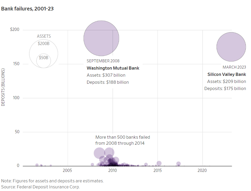
WSJ visuals illustrate the failure of Silicon Valley Bank and how four chart types are used for different purposes.

The first is this bubble chart comparing SVB to the next largest bank implosion since 2001: Washington Mutual Bank. The chart—and the article title, “Here is what the second-largest bank failure in U.S. history looks like in graphics”—might exaggerate the issue. Yes, the data and title are accurate, but SVB’s customer base was limited to “a very exclusive group of companies: tech startups and venture-backed health care companies,” as my friends at The Strebel Planning Group explain well. In other words, large, more diversified, and more cautious banks are not likely to fail, despite dramatic headlines.

The second visual, a bar chart (technically a column chart because the bars are vertical), effectively shows when inflows of money turned to outflows. The purple shows the steep, immediate decline, ending in $42 billion—hence, the “run on the bank” that SVB couldn’t cover.

The third graphic is a 2D, stacked area chart, which is used to show the magnitude of a change, something the WSJ clearly wants to emphasize. Again, the chart looks bad, and it is, but a joint statement by the Treasury, Federal Reserve, and FDIC promised to cover all loses, even those not covered by FDIC insurance.

With a simple line chart, the last graphic (not shown here) illustrates how much SVB depended on bonds, which have lost value over time. The chart type is a good choice for showing a change, including a steep incline in 2021.

All these charts illustrate different types well but, at-a-glance, don’t tell the full story. Perhaps one or two more visuals that puts SVB in greater context of other banks would give a more complete picture of the banking industry’s potential exposure. This could ease public concern and maintain confidence in the system.

Warren Buffett's Letter Refers to “an Economic Illiterate”

Warren Buffett’s annual letter to Berkshire Hathaway shareholders is always greatly anticipated, and this year, it doesn’t disappoint. All letters since 1977 are archived on this page of the company’s bare-bones website, which is a class topic in itself.

Last year was rocky for investors, but 92-year-old Buffett maintains confidence. As usual, his writing tone is straightforward and no-nonsense; for example, he writes, “‘Efficient’ markets exist only in textbooks. In truth, marketable stocks and bonds are baffling, their behavior usually understandable only in retrospect.” The most quoted excerpt seems to be his defense of stock buybacks:

When you are told that all repurchases are harmful to shareholders or to the country, or particularly beneficial to CEOs, you are listening to either an economic illiterate or a silver-tongued demagogue (characters that are not mutually exclusive).

Buffett’s style is also conversational. This paragraph demonstrates his humility as well:

At this point, a report card from me is appropriate: In 58 years of Berkshire management, most of my capital-allocation decisions have been no better than so-so. In some cases, also, bad moves by me have been rescued by very large doses of luck. (Remember our escapes from near-disasters at USAir and Salomon? I certainly do.) Our satisfactory results have been the product of about a dozen truly good decisions – that would be about one every five years – and a sometimes-forgotten advantage that favors long-term investors such as Berkshire. Let’s take a peek behind the curtain.

In addition to the writing style, the letter is a good example of clear organization, audience focus, and varied sentence structure. Finance students may enjoy reading his billionaire’s wisdom, just as his investors do.

Student Handout: Tips for Using ChatGPT

This handout guides students through using ChatGPT responsibly. I take a realistic approach, assuming that students will use the program regardless of our insistence not to.

Revise and use as you wish; you can also download this Word document. I would appreciate knowing what changes you make, so I can consider revisions.

Tips for Using ChatGPT for Your
Business Communication Assignments

Ask ChatGPT for help generating ideas.

If you’re having trouble coming up with or honing an idea for a writing assignment or presentation, ask ChatGPT. The program can help you move past writer’s block, clarify your thinking, and narrow down a topic. Practice asking follow-up questions until you get better responses.

Think of ChatGPT as a writing partner.

Imagine that the program is a tutor or writing center consultant, who would ask you questions and give you ideas and feedback—not write for you. Use ChatGPT as part of an iterative thinking process.  

Use your natural, authentic voice.

ChatGPT is a robot and sounds like one. You’re taking this class to find your own personal writing and speaking style. If ChatGPT writes for you, you’re missing the opportunity to convey your personality. What differentiates you at work is your character—who you are as a person. No AI technology can ever match your sense of humor or style. 

Adapt writing to your audience.

Every assignment in this class has a defined audience. ChatGPT can’t build a relationship; only you can do that. You’re more likely to inspire or persuade someone when you use your emotional intelligence to understand what moves and motivates someone, and then tailor your writing to that person.   

Beware of misinformation.

ChatGPT tends to “hallucinate”—invent information that doesn’t exist, particularly sources like books and journal articles. If you ask the program to provide evidence to support claims, check everything and add sources after 2021, which ChatGPT can’t access. For your own credibility, do your own research.

Learn from ChatGPT’s corrections.

If you ask ChatGPT to correct your grammar, ask it to explain the mistakes it corrected and the grammar rules, so you can learn for the future.

Plan ahead and expect change.

As of now, ChatGPT is often overloaded, so you’ll need to plan ahead if you rely on it. Also, these suggestions are based on ChatGPT as of January 2023. The program will evolve.


Developed by Amy Newman, February 2, 2023. Revise and use as you wish.

Inspired by Lance Cummings, @LanceElyot, “Student Contract for AI Creativity (draft),” Twitter, January 10, 2023.

FDA Suggests Less Lead in Baby Food

The U.S. Food and Drug Administration (FDA) issued guidance for baby food manufacturers, and the messages serve as good examples of reports and persuasion:

  • Action Levels for Lead in Food Intended for Babies and Young Children: Draft Guidance for Industry. This is a text report that students could analyze for organization, writing style, evidence, data visualization (or lack there of), etc.

  • Federal Register Notice. This legal-sounding document explains how to submit comments, either by “electronic submission” or “written/paper submission,” an archaic-sounding process. People also can order paper copies of the draft guidance, something you might do in 1970: “Send two self-addressed adhesive labels to assist that office in processing your request.”

Several times, on the website and within in each document, the agency reminds us, “Contains Nonbinding Recommendations Draft-Not for Implementation.” The agency further describes the “guidance”:

In general, FDA’s guidance documents do not establish legally enforceable responsibilities. Instead, guidances describe FDA’s current thinking on a topic and should be viewed only as recommendations, unless specific regulatory or statutory requirements are cited. The use of the word should in FDA guidances means that something is suggested or recommended, but not required.

The approach attempts to involve industry and consumer groups, who likely have a lot to say about the FDA’s data and recommendations. In the introductory website text, the agency says it considers the goals “achievable by industry when control measures are taken to minimize the presence of lead.” We’ll see whether others agree. Already, one consumer group weighed in, saying the guidance “doesn’t go far enough,” while Gerber and other companies are “reviewing” the proposal.

Making Sense of Big Numbers

On a recent “No Mercy, No Malice” podcast episode (NSFW), Scott Galloway compares Meta’s spend on Reality Labs—$1 billion per month—to what he considers better investments.

In Business Communication and Character, I suggest that students compare data to concrete objects to help people understand the magnitude. Galloway offers several suggestions to put the expense into context—and to show how Mark Zuckerberg might put the money to better use than building a doomed Metaverse. One is to “pay the entire cost of attendance for every undergrad in the University of Texas and California systems.”

Of course, his point is how much money is being wasted. For students, it’s a good example of making numbers more relevant to an audience.

Image source.

Jan. 6 Committee Report

After almost two years of investigative work, the U.S. House committee complete its report about the January 6 attack on the U.S. Capitol. As we might expect, the report has some features we teach in business communication classes.

The 845-page report starts with a list of contributors and a “letter of transmittal”—language I saw in old textbooks when I started teaching in 2004. Next, we see a few “forward” statements from elected officials, which seem like political posturing, until we get to the six-page table of contents. Students will recognize that the headings are descriptive but aren’t quite parallel: some are full sentences, while others are phrases. Bias—or persuasion—is clear in the heading choice, for example, “The Big Lie,” and an all-caps quote, “JUST CALL IT CORRUPT AND LEAVE THE REST TO ME.”

If you’re brave enough to discuss the report in class, other report features are worth reviewing. The 193-page executive summary is unusual for a business report, which is usually about 10% of a total report. The portrait layoff and footnotes are typical for a more formal report, but the photos, used primarily for emotional appeal, are not. Depending on your perspective, the writing style is vivid, inflammatory, or something else. The report on documentcloud.org is navigable by page numbers and a clunky search, but it could be more interactive, for example, with hyperlinks from the table of contents. This is a public document, so students could analyze the audiences and communication objectives.

FTX Bubble Chart

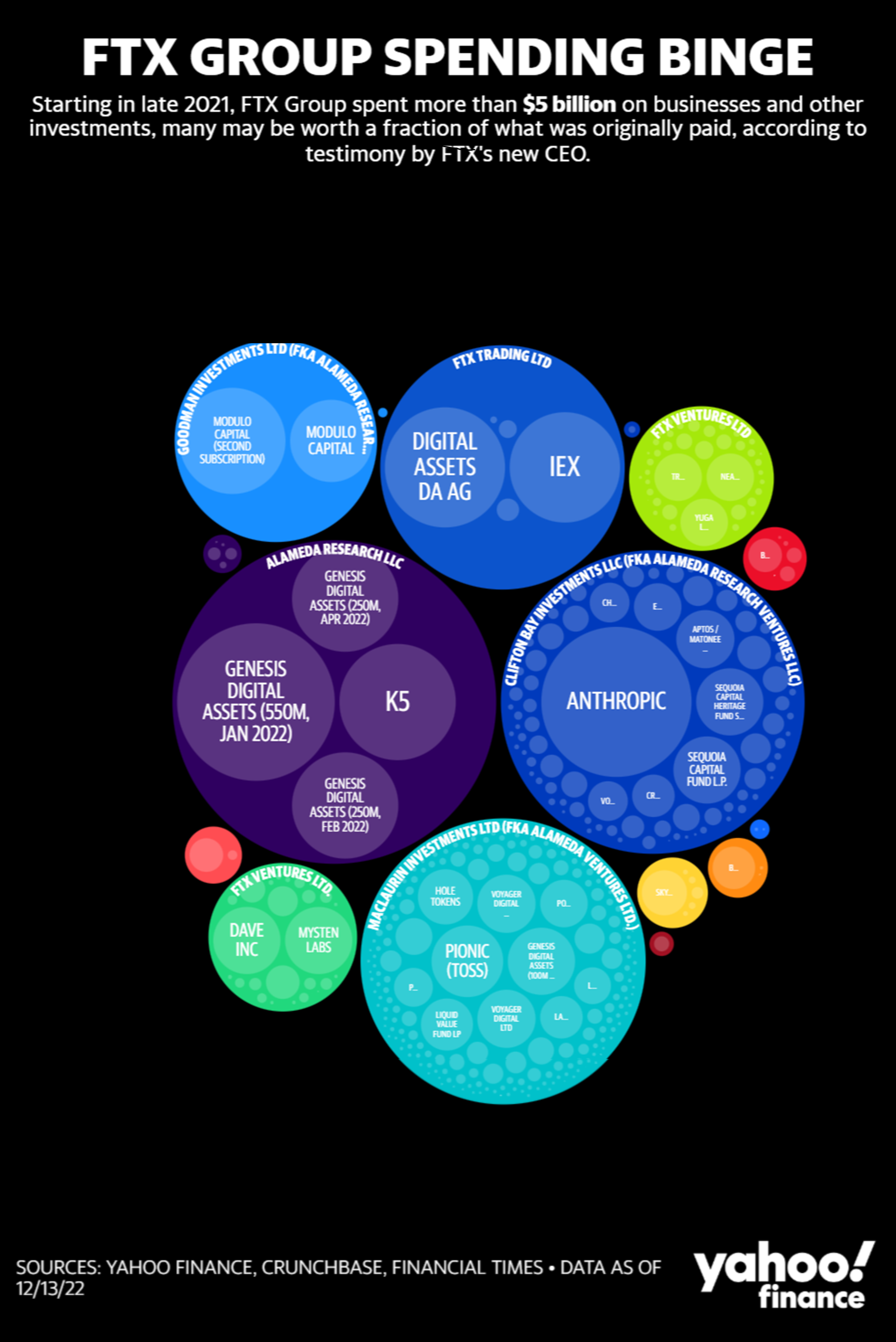
As fraud and conspiracy charges roll in for FTX Founder Sam Bankman-Fried (SBF) so do the graphics. Yahoo has a doozy—a worthy visual showing where $5 billion was spent (and lost), unbeknownst to investors.

As we expect, this bubble chart packs in a lot of data, and the interactivity explains why some bubbles show cut-off or no text at all. Mouse-over text is clear, but it’s hard to pinpoint some small bubbles. By small, I mean those amassing a mere $5 million or less—or “Flourishing Humanity,” which, sadly, received only $80,000. Zooming in solves the text problem, but it’s not intuitive (at least to me) on a laptop. I almost want another level of detail. Another click could tell me what the Pangea Cayman Fund is.

Color contrast is an obvious issue in this chart, with large swaths of black that prevent the at-a-glance value of a good chart on a laptop. Some of the brighter colors make the white text hard to read, but it’s better when zoomed in.

If you share this chart with students to analyze, I hope they’ll find the comma splice in the title.

Misleading College Financial Aid Letters

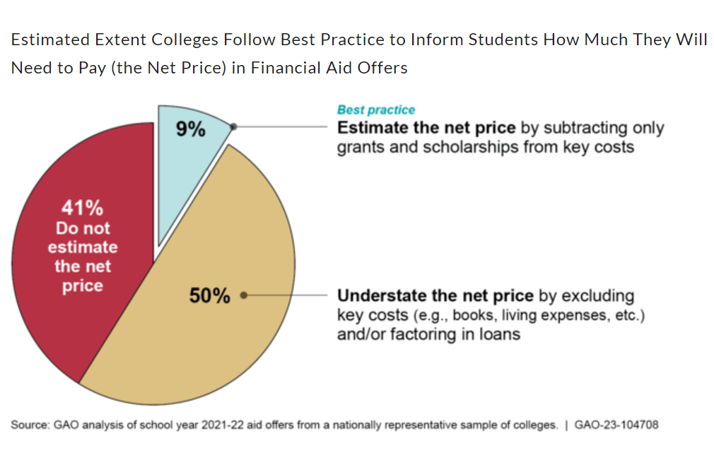
A lively class discussion is almost guaranteed if you introduce the topic of college financial aid letters. A U.S. Government Accountability Office (GAO) report found that 91% of colleges either underestimate net prices or fail to include the net price entirely.

In their offer letters, the GAO recommends that colleges subtract only grants and scholarships that students will receive but include ancillary costs like “tuition, fees, housing and meals, books, and living expenses.” Any parent with a college-age student—or any student paying their own way—know that these expenses add up.

The GAO report is also a good example for students to analyze. It follows some principles we teach in business communication classes: a clear structure and detailed table of contents (with hyperlinks); a mix of text, tables, and other graphics (with callouts); and an executive summary. Some design features are a bit curious, for example, left-column headings and squiggly lines around tables.

Overall, best practices are clear, and I hope that colleges take the GAO’s advice. The news raises issues of integrity and accountability. I find it interesting that the GAO was renamed the Government Accountability Office from the Government Accounting Office in 2004. The name does seem to better fit the organization’s mission.

Problems with Medical Jargon

A new study identified specific phrases that patients would likely misunderstand from their healthcare provider. Students probably know that medical jargon causes problems, and they might be interested in analyzing their own provider’s communication.

The survey asked respondents to interpret these phrases, listed in the article supplement. In most cases, respondents were asked whether the news is good or bad. I can see how some could go either way. What does progressive, unremarkable, or impressive mean in a medical diagnosis? We could consider this issue a problem with humility in the medical profession.

Understanding didn’t improve with either age or education. In the demographic section, survey authors did provide non-binary options for gender: female, male, non-binary, other. A related article this week describes data scientists’ challenges when asking about gender. Although researchers found no significant differences in this study, in other studies, gender matters greatly, and students should consider this question carefully in their own primary research.

Public Talk of Layoffs

I remember when people where ashamed of being laid off. Old movies show men leaving for “work” months after they no longer had a job.

Today, people find community in discussing their fate, and they use their favorite platform—sometimes their former employer—to share their stories. Partly, the shame is lifted because of the numbers: 11,000 at Meta; 10,000 at Amazon; 3,700 at Twitter; 950 at Salesforce; and many others. In a colorful, but mostly unreadable chart, TrueUp logged 192,997 so far in 2022. (Maybe the logos could be scalable?)

The unfortunately named Blind app connects employees in several industries, particularly tech (95% of Twitter employees signed up). Students can review comments for an inside scoop just as they do on Glassdoor.

I feel encouraged by the public postings. In addition to the obvious compassion and vulnerability, the stories—good and bad about the layoff process and communication—keeps employers on their toes. Also, people are finding new jobs, and this will get easier as the market, once again, opens up.

SoftBank Tones Down Presentations

SoftBank is changing how it presents information. Gone are the “flamboyant” charts. At the latest earnings results presentation, CEO Masayoshi Son started by describing what will be different this time and going forward: he will no longer deliver results but will pass that responsibility to the chief financial officer.

First, he addressed directly concerns about his health. He says, “You may ask why . . . “ [translated to English] and proceeded to tell us in about 30 minutes. After background about his interest in the “information revolution,” he explained,

Goto [CFO] is more suitable than me for playing defense. Me, I’m an aggressive person, not a defensive person, and I’d like to concentrate on Arm [chip manufacturer] for the time being.

Son said he’ll still be active: “I’ll continue to do the shareholder meetings, and when something unpredictable happens, I’ll come back anytime.”

Son has shown infamous charts with golden geese, unicorns, and rainbows. I wrote about his “hypothetical” line charts—like the WeWork line chart above, with an arrow but no data—in Chapter 9 of Business Communication and Character.

The current earnings deck is notably different, and this slide shows why. Losses are mounting, Son’s more “subdued role” matches SoftBank’s less aggressive investing style. The company has taken a dose of humility.

Surgeon General's Report Example

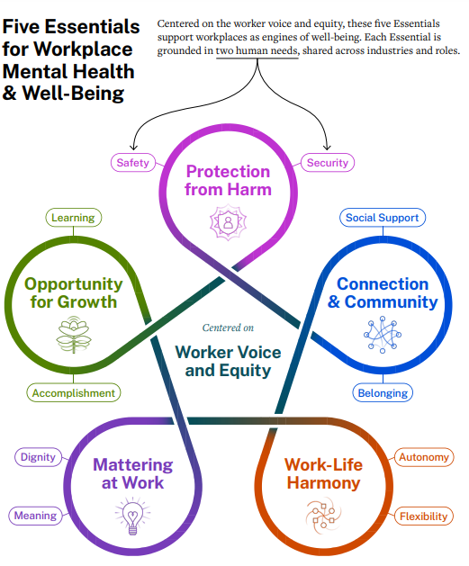
The U.S. surgeon general’s report, Framework for Workplace Mental Health & Well-Being, offers several discussion points for business communication students. The report itself is unusual, the first time a surgeon general has weighed in on what the media is framing as “toxic workplaces.” Coupled with over-reporting about “quiet quitting,” the report highlights problems at work.

An obvious discussion with students is about the report format and organization. It serves as a good example of a primarily text-based report, with few graphics except for the visual summary, which serves as an organizational cue throughout the 46 pages. We see some data and plenty of footnotes but no charts.

The report content—and how the U.S. surgeon general presented the findings on PBS NewsHour, for example—is worth exploring. First, of course, we want our workplaces to be more positive places. The recommendations presented are sound and perhaps obvious; in addition, as Vivek Murthy says, organizations have better outcomes when they are healthier places to work.

Second, what strikes me is the lack of accountability for organizational leaders and the challenges they face. Not once in the PBS interview does Murthy mention “leaders” or “managers”—actual people responsible for putting his recommendations in place. Murthy’s opening letter in the report is personal—about his immigrant parents—but his content summary is not. He blames the pandemic and uses impersonal subjects, for example, “organizations,” “we,” and “workplaces.” In the accompanying deck, titled “Reflection Questions,” “I” is never used, and “leaders” is used as the subject only once in the 20 questions; “we,” “workplace,” and “workers” prevail.

In the report, leaders, managers, and supervisors are called to action, sometimes in vague ways, for example, having the “opportunity” to do better. But the HR department gets no mention at all. A Wall Street Journal article summarizes, “The surgeon general’s guidance on the role of the workplace in well-being comes as many workers report work stress and difficulty concentrating.” I wonder how “workplaces” will respond.

Charts for Students to Analyze

NYU professor, author, and podcast host Scott Galloway has a new book, Adrift: America in 100 Charts, with good examples for students to analyze. His newsletter also describes charts, for example, a few that illustrate the U.S. incarceration problem. He uses data to conclude that our extraordinary incarceration rates do little to reduce crime.

On one page, he uses a bubble, a column, a paired column, a people graph, and a line chart. Each is chosen well for the purpose, although he doesn’t use message/descriptive titles, as business communication faculty would advise. Students will find other improvements, for example, maybe adding data labels to the first chart (despite the Y axis) and better distinguishing “All Men” in the people chart.

Galloway’s posts regularly offer examples to engage students in current political, tech, and business topics.

Not about charts, but this podcast episode (posted here) made me laugh out loud. Galloway describes text messages between Elon Musk, Satya Nadella, Jack Dorsey, and others. Turns out, they struggle with technology just like the rest of us. This is Musk’s response to Dorsey, who is waiting for him to join a meeting.

Overreliance on Annual Performance Reviews

Before and during the pandemic, several companies stopped doing annual employee reviews, but many have brought back the practice. Reports show that slowed hiring and increased layoffs are causing more pressure for employees to perform; managers want more ways to track and document performance. Without reviews, managers could appear to have lax standards, failing to hold employees accountable for outcomes.

The annual documentation, meeting, and goal-setting are not the real problems. Managers are uncomfortable giving feedback and rely only on once-a-year conversations. Employees need to know, ongoing, how their performance measures up to expectations so they have a chance to improve. When done well, annual reviews are a summary of what employees already know about where they stand. Ongoing feedback encourages self-accountability, holding oneself accountable without relying on external approval.

A Bloomberg Businessweek article (with simplistic, nonparallel charts) offers alternatives to the annual review, which could supplement the annual meeting. The recommendations are in line with good business communication: check in regularly, encourage the employee to reflect, focus on the future instead of the past, collect multiple opinions, etc.

Columbia’s Ranking, Data, and Communication Issues

The news of Columbia University’s tumble in college rankings from 2 to 18 offers business communication lessons for reporting data—and for persuasive arguments. In February 2022, Professor of Mathematics Michael Thaddeus identified discrepancies in how the Columbia reported data for U.S. News’s annual list. His analysis resulted in a persuasive argument with the following main points summarized in the introduction:

In sections 2 through 5, we examine some of the numerical data on students and faculty reported by Columbia to U.S. News—undergraduate class size, percentage of faculty with terminal degrees, percentage of faculty who are full-time, and student-faculty ratio—and compare them with figures computed by other means, drawing on information made public by Columbia elsewhere. In each case, we find discrepancies, sometimes quite large, and always in Columbia’s favor, between the two sets of figures.

In section 6, we consider the financial data underpinning the U.S. News Financial Resources subscore. It is largely based on instructional expenditures, but, as we show, Columbia’s stated instructional expenditures are implausibly large and include a substantial portion of the $1.2 billion that its medical center spends annually on patient care.

Finally, in section 7, we turn to graduation rates and the other “outcome measures” which account for more than one-third of the overall U.S. News ranking. We show that Columbia’s performance on some, perhaps even most, of these measures would plunge if its many transfer students were included.

New reports about Columbia’s fall credit Thaddeus’s analysis. The argument serves as an excellent example for our students, who might also explore their own views about the college rankings. In addition to data integrity, Thaddeus questions the value of these rankings and the influence they have on students’ college choice.

Students can also analyze the university’s response. In a statement posted on September 9, Provost Mary Boyce admitted, “we had previously relied on outdated and/or incorrect methodologies.” She also expressed “regret”:

The Columbia undergraduate experience is and always has been centered around small classes taught by highly accomplished faculty. That fact is unchanged. But anything less than complete accuracy in the data that we report—regardless of the size or the reason—is inconsistent with the standards of excellence to which Columbia holds itself. We deeply regret the deficiencies in our prior reporting and are committed to doing better.

The statement is more about future plans, for example, participating in the Common Data Set initiative, than about acknowledging wrongdoing. A fuller apology, including the impact of the inaccuracies and posted earlier than just days before rankings were published, would have demonstrated more humility and integrity.

New McKinsey Report with Charts

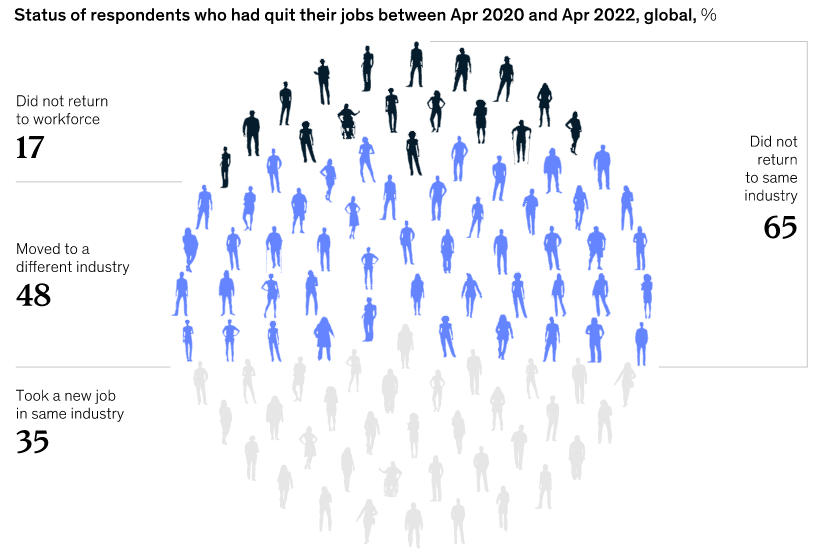
Business Communication and Character always includes a McKinsey report as a positive example, and the latest report about attrition and hiring doesn’t disappoint. Posted on the website without a fee, the report starts with a clear heading:

People keep quitting at record levels, yet companies are still trying to attract and retain them the same old ways. New research identifies five types of workers that employers can reach to fill jobs.

Main points are interspersed throughout the report in blue text, and descriptive headings with background images provide clear section divisions. The report is logical and easy to read, starting with the reasons for “The Great Renegotiation” or “The Great Attrition” (renamed from the “The Great Resignation” in previous news reports). Next, readers learn about “five personas”—types of workers and how to target each for employment.

As I always enjoy in McKinsey reports, the charts are clear, visually appealing, and varied. This report uses a simple color scheme and charts as they should be used: to interpret data and provide a lot of information at-a-glance.

Overall, this is a good example for our business communication students to follow.

U.S. DOT Airline Dashboard

The U.S. Department of Transportation (DOT) created what it calls a “dashboard” for passengers to know what to expect when their flight is delayed or cancelled. This work results from ongoing debate about airlines’ responsibility, particularly given the many issues travelers have experienced since the pandemic. Transportation Secretary Pete Buttigieg has pushed the airlines to offer at least free meals for 3-hour or longer delays and free hotel stays when passengers need to wait at an airport.

Although some airlines say they already offered these accommodations, DOT Deputy Secretary Polly Trottenberg said this is about enforcement: “Now that it’s in the customer service plans, it’s not something in discretion. It’s something we can enforce. And I think this dashboard is really going to kind of raise the state-of-the-art for consumers.”

As a visual, the dashboard works well. Looking across the rows, we see clearly what to expect from each of the airlines. Categorizing the actions by cancellations (shown here) and delays makes sense from the passenger’s perspective. However, the graphic is skewed right on the page because of the left-side column.

In addition, when I hear “dashboard,” I think of a more complex, interactive spreadsheet. The only functionality seems kind-of silly. The dropdown menu at top doesn’t add value because we can just as easily scan across to see what any airline provides. Also, I’m not sure why anyone would want the ability to “keep only” or “exclude” specific items—or to see repetitive text when they mouseover the markings. Finally, I chose “view data” and got the following in a pop-up window, which communicates nothing relevant.

I would call the visual a table, matrix, or grid. But I don’t want to disregard the good news: airlines are communicating what customers can expect, can be held accountable and, in some cases, are providing better service.