Vatican's New Tone About Gays

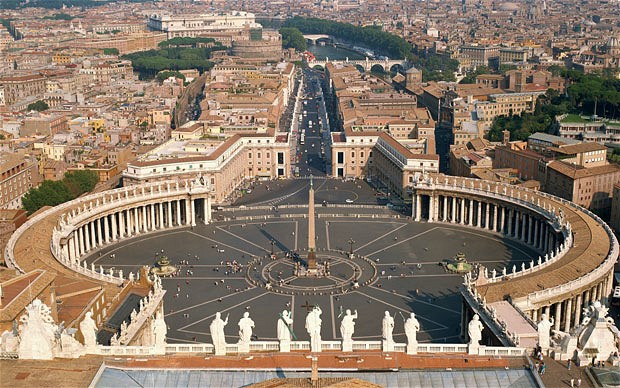
Vatican_2131403bIn what sounds like a significant turnaround, Catholic bishops released a summary of their two-week meeting, including new acknowledgements of homosexuals:

Welcoming homosexual persons

     50.        Homosexuals have gifts and qualities to offer to the Christian community: are we capable of welcoming these people, guaranteeing to them a fraternal space in our communities? Often they wish to encounter a Church that offers them a welcoming home. Are our communities capable of providing that, accepting and valuing their sexual orientation, without compromising Catholic doctrine on the family and matrimony?

     51.        The question of homosexuality leads to a serious reflection on how to elaborate realistic paths of affective growth and human and evangelical maturity integrating the sexual dimension: it appears therefore as an important educative challenge. The Church furthermore affirms that unions between people of the same sex cannot be considered on the same footing as matrimony between man and woman. Nor is it acceptable that pressure be brought to bear on pastors or that international bodies make financial aid dependent on the introduction of regulations inspired by gender ideology.

     52.        Without denying the moral problems connected to homosexual unions it has to be noted that there are cases in which mutual aid to the point of sacrifice constitutes a precious support in the life of the partners. Furthermore, the Church pays special attention to the children who live with couples of the same sex, emphasizing that the needs and rights of the little ones must always be given priority.

According to Mashable, "Their report also reflected the views of ordinary Catholics who, in responses to Vatican questionnaires in the run-up to the synod, rejected church teaching on birth control and homosexuality as outdated and irrelevant."

However, a TIME article tempers excitement by explaining that the document says nothing binding: no new policy has been created as a result of the meeting. Still, the quasi-inclusive language is an encouraging shift.

Discussion Starters:

  • Read the full report from the Vatican. What strikes you about the tone and messages?
  • Is the news premature? Should gay rights supporters be happy about the news?

Darden Investor Creates 297-Page PPT Report

Starboard Value, a Darden investor, created an extensive PPT presentation to recommend ways to improve the struggling Olive Garden restaurants. Sales and stock prices have been falling.

Starboard, which owns eight percent of Darden's stock, criticizes Olive Garden harshly. The presentation uses clear, specific message titles, discussed in Chapter 10, and the word choices are direct.

  Darden PPT

The presentation is a good example of mixing text and graphics in a PowerPoint report.

Discussion Starters:

  • Read the message titles across the report. Do you find a cohesive argument?
  • Which pages work best, and which could be improved? Assess the balance of text and graphics and how clearly main points are conveyed.
  • Assess the strong language. Is this appropriate for the audience? What are the possible consequences?

Graphical Student Loan Calculator

Embracing the value of interactive graphics, The New York Times created an online calculator for student loans. The results may be depressing, but the calculator tells students how much they will owe and what they need to earn to cover the expense. By filling in a few fields, students can see how interest rates, loan term (years), and additional monthly payments affect their principal and interest.

Student Loan Calc

Using $29,400 as the average loan for a student graduating in 2012, we see that students need to earn that amount per year. Of course, more is better. At $35,923 per year, the loan repayment amount would equal about 20% of a student's discretionary income. (Of course, that may vary tremendously.)

Seeing the data graphically may help students get a clearer picture about what to expect-for better or worse.

Discussion Starters:

  • Do you find the calculator easy to use? Is it useful?
  • What other ways can you visual the data? Consider more creative graphics than this bar chart.
  • What's your view of the recommended 20% of discretionary income for student loan repayments? In what ways could it vary based on geographical, health, personal, and other factors? Would this be a realistic number for you?

Airbnb Sells Sustainability

Airbnb infographicIn its latest advertising campaign, Airbnb is pushing its role in sustainability. Taking lessons from Chapters 5 and 7 in the textbook, Airbnb boasts saving the planet in concrete terms.

According to a recent report, published with the Cleantech Group, "In one year alone, Airbnb guests in North America saved the equivalent of 270 Olympic-sized pools of water while avoiding the greenhouse gas emissions equivalent to 33,000 cars on North American roads." The company also says that North American Airbnb guests use 63% less energy than do hotel guests, while European guests use 78% less.

The report results are summarized in an infographic on Airbnb's blog.

Discussion Starters:

  • Read Airbnb's report summary. Which statistics make sense to you, and which are perhaps overstated or irrelevant?
  • What do you think of Airbnb's marketing approach? Do you find it effective? Why or why not?
  • Asses the company's infographic. What principles from Chapter 9 are followed effectively?  

Walmart Edits New York Times Article

Walmart couldn't let a critical piece in The New York Times go unanswered. In an op-ed article, "The Corporate Daddy," Timothy Egan contrasts Walmart and Starbucks:

"As long as the Supreme Court says that corporations are citizens, they may as well act like them. Starbucks is trying to be dutiful - in its own prickly, often self-righteous, spin-heavy way - while Walmart is a net drain on taxpayers, forcing employees into public assistance with its poverty-wage structure."

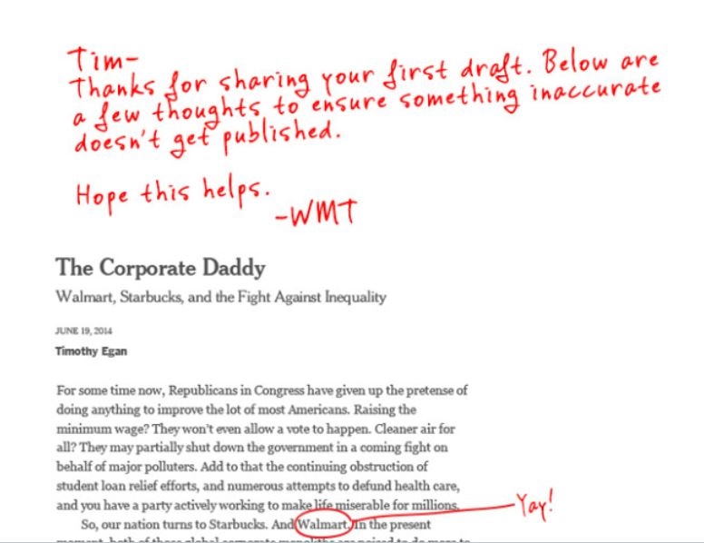
Walmart editsThe impetus for the commentary seems to be Starbucks' recent announcement of tuition reimbursement for employees. Although Egan says, "It's a sad day when we have to look to corporations for education, health care, and basic ways to boost the middle class," he sees an opportunity for large employers-and criticizes Walmart for contributing in the wrong direction.

With tongue-in-cheek humor, Walmart posted an edited version of the article. The edits point to different sources and additional considerations for the value Walmart brings. 

Discussion Starters:

  • What's your view of Walmart's approach? Why do you think management took this approach? What alternatives would they have considered to refute the article?
  • Assess evidence provided in the article and in Walmart's responses. In each case that Walmart disputes evidence, which argument do you find more believable?

White House Climate Change Report

The U.S. Global Change Research Program just published a draft report, "Climate Change Impacts in the United States," which has gotten a lot of attention. The report blames human activity on climate change and warns of increasing erratic weather, damage to food supplies, and more warming conditions.

To help people understand the main points of the 829-page, 174 MG document, the authors provide a "Highlights" page on the Global Change website. But the highlights are still more than the average person will read.

Climate Change ReportThe website also offers an online version of the full report, organized around the following topics:

  • Our Changing Climate
  • Sectors
  • Regions
  • Response Strategies

The report is referred to as a draft version. Will the final be even longer?

In another attempt to help us understand the data, this Washington Post article highlights 15 graphics.

Discussion Starters:

  • Does the length of the report matter? Who are the audiences, and how do you think each constituency would, if at all, read the report?
  • What principles from Chapter 10, Writing the Report, does this report follow? Consider the organization, visuals, writing style, and so on.
  • Compare this report to another recently published: "Not Alone: The First Report of the White House Task Force to Protect Students From Sexual Assault." What differences and similarities do you see, and what could account for them?

Polite Negative Reviews Can Boost Sales

JCR.jpg

How politely someone writes a review can affect how customers react. A new study, "We'll Be Honest, This Won't Be the Best Article You'll Ever Read: The Use of Dispreferred Markers in Word-of-Mouth Communication," published in the Journal of Consumer Research, gave subjects five versions of online reviews. Reviews that included nice phrases, such as, "I'll be honest," and "I don't want to be mean, but…" influenced people to possibly pay more for a product, even though the review was negative.

A University of Chicago Press article further described the results:

"The study also asked participants to complete a survey evaluating the 'personality' of the brand. Results showed that the review using the marker of politeness caused the brand to be seen as more honest, cheerful, down-to-earth, and wholesome than the same review without the polite customer complaint."

Discussion Starters:

  • How might you explain the study results? In what ways do they make sense to you-or not?
  • Read the entire study and assess the methodology using principles in Chapter 9 of the book.
  • How does this study align with principles for conveying bad news in Chapter 8?

Cute Infographic, But What's the Point?

Here's an attractive infographic, but viewers may struggle with the point. (Click for a larger image.)

Allstate-Infographic-FINAL_5.31.13

How can you improve the infographic?

  • Who do you think is the audience?
  • What is the purpose? Specifically what would the designer like the reader to do?
  • What "message title" would make the main point up front more clear?
  • How is the graphic organized? What sequencing of data could be more logical?
  • How could the font style be improved for easier reading?
  • What text for each component would more clearly convey each point?
  • How else could you improve the text?
  • What design changes would you make, for example, to the colors, images, and background graphics?

Discussion Starters:

  • This infographic was produced by Allstate insurance, and it is, after all, an information graphic. What are the consequences of making the main point clearer? In other words, why might Allstate choose this approach?
  • What one data point in the infographic is the most convincing?
  • If you're renting now, does this persuade you to get renters' insurance?

NSA's New Press Kit

The National Security Agency (NSA) published a shiny, new press kit to try to change its image. Damaged by reports of spying, the NSA's reputation could use some freshening up.

NSA press kit

With self-aggrandizing phrases, such as, "Saving Lives," "Cybersecurity: A Team Sport," "Operating as a Responsible Citizen," and "The Mission that Never Sleeps," the NSA is trying to combat negative perceptions.

The kit also addresses "Myths" about the NSA, such as, "The NSA has agents who can arrest hackers or other cyber bad guys," and "NSA monitors the world's communications systems at all times."

Discussion Starters:

  • Read the entire press kit. What are the NSA's main messages?
  • Assess the text and graphics. How well do they work together? What images are most prevalent in the kit?
  • Which themes or points do you find most and least convincing?

Teenager Proposes Font Change for $234m in Savings

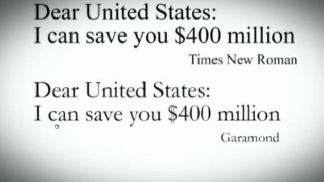
A 14-year-old boy claimed that the U.S. government could save $234 million by switching from Times New Roman to Garamond. But The Washington Post reports, "That claim is patently false."

Suvir Mirchandani, from Pittsburgh, made a good point: a smaller or thinner font could reduce paper and toner expenses. Garamond simply takes less ink than does Times New Roman.

Garamond-font-630x354

But experts say that the government doesn't print nearly the quantity that Mirchandani estimated in his paper, published in the Journal of Emerging Investigators. The Government Printing Office, which prints about half of the government's work, spent only $700,000 on ink last year. Mirchandani admits that he didn't get his information directly from the government in time for his paper to be published.

Second, Mirchandani failed to consider that the font change, as you see above, makes the printing harder to read. That's a real consequence of a smaller or thinner font-and who knows what problems that would cause and how much they would cost.

Image source.

Discussion Starters:

  • Read Mirchandani's paper. Can you identify the flaws?
  • How would you describe the consequences of a font that's more difficult to read? Consider who reads government documents and for what reasons.

Facebook's "Cutesy" Annual Report

A TechCrunch article refers to Facebook's report to its partners as "cutesy" and "a playfully illustrated eMagazine." In 68 pages, "The Annual" uses a mix of executives' quotations, infographics, and photos to taut accomplishments in 2013. 

FB Annual report

Facebook also published a traditional annual report for investors.

Discussion Starters: 

  • What's your impression of The Annual? Analyze the audience, content choices, organization, writing style, and graphics. 
  • Could you see more traditional companies adopting some of The Annual's components for their own annual reports? Think of a few examples of companies and which aspects of the report might be work well for their investors or partners.
  • How does Facebook, if at all, describe teens' declining use of the social network?

Did Walmart Misrepresent Employee Wage Numbers?

Walmart U.S. CEO Bill Simon presented questionable data about employee wages. During the Goldman Sachs 2013 Annual Global Retailing Conference, Simon showed a slide, "It all starts with an opportunity." A bullet point says that 475,000 employees earn more than $25,000 per year (excluding benefits). 

  Walmart GS presentation

Here's the entire presentation.

The trouble is that Walmart employs 1.3 million employees in the U.S. (2.2 million worldwide). That leaves 825,000 earning less than $25,000 a year. A Walmart representative clarified that only store employees (about 1 million) were considered for this point. Still, that leaves roughly half of them earning below $25,000 a year.  

Discussion Starters:

  • The U.S. CEO seemed to walk into this controversy. How could it have been avoided?
  • How, if at all, does Walmart's clarification affect your view of how the company pays its employees?


Facebook Finally Admits Decline in Young Teens

Facebook-teensAfter denying reports of young teens forgoing Facebook, company officials have finally admitted the decline. On a third-quarter earnings call, CFO David Ebersman told analysts,

"Our best analysis on youth engagement in the US reveals that usage of Facebook among US teens overall was stable from Q2 to Q3, but we did see a decrease in daily users, specifically among younger teens."

This drop seemed to shake investors' confidence. The stock dropped 2% on the news.

According to the CNET article, Ebersman also admitted that it's difficult to determine teen activity becauses this group often fabricates dates of birth. 

Earlier reports claimed that Facebook isn't cool now that mom and dad (and grandma) have accounts. Some statistics show that young teens are flocking to sites such as Twitter and Tumblr instead. 

Image source.

Discussion Starters:

  • How do you think Facebook made the decision to stop denying reports? What do you think were the deciding points?
  • What's your view of Facebook's claim about fabricated birth dates? What are the responsibilities of users, the company, parents, and perhaps other groups?

McDonald's Offers Healthier Menu Items

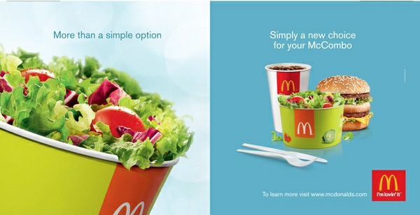
After much criticism of its unhealthy food and advertising targeted towards children, McDonald's is offering more options for people looking for healthy food.

McDonald's menu

In 20 of its major markets, accounting for 85% of its total sales, McDonald's will revamp the menu. Costing $35 million through 2020, the move may pave the way for other fast-food chains. This is Bill Clinton's hope, as he said in a press release about the initiative, which is part of the Clinton Global Initiative in New York:

"If we want to curb the catastrophic economic and health implications of obesity across the world, we need more companies to follow McDonald's lead and step up to the plate and make meaningful changes."

CEO Don Thompson explained the opportunity:

"This is a particular opportunity to partner with the Clinton Foundation and the alliance to leverage our scale and size and marketing prowess to be able to influence more purchases of fruits and vegetables."

On the "Nutrition Choices" page of McDonald's website, the company posted a progress report showing its "National Nutritional Commitments." For each, the report describes the company's "journey."

Discussion Starters:

  • Read McDonald's progress report. Who are the primary and secondary audiences? What are the company's objectives? How is it organized? How does the company use graphics to highlight main points?
  • Analyze how data is presented in the report. How does the company use quantitative information to prove its points? In what ways is the presentation successful, and where does it fall short?

Fast-Food Workers Strike over Pay

The fast-food industry has been under fire for paying low wages. The website "Fast Food Forward," asks people to sign a petition:

"We can't survive on $7.25!

"In America, people who work hard should be able to afford basic necessities like groceries, rent, childcare and transportation.

"While fast food corporations reap the benefits of record profits, workers are barely getting by-many are forced to be on public assistance despite having a job.

"Raising pay for fast food workers will benefit workers and strengthen the overall economy."

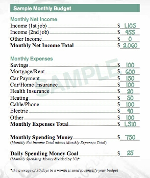
McDonald's budgetIn July, McDonald's mistakenly publishing Practical Money Skills, a budgeting journal for employees. It was a nice idea, but the tool has made obvious that employees have a tough time living on McDonald's wages alone. A Mother Jones article  criticized the advice:

"The most practical tip: In order to obtain a living wage working at McDonald's 35 hours per week (monthly income: $1,105), get a second job. Least practical facet: as MSNBC's Maria Perez notes, it "leaves out necessary expenditures like food, child care, clothes and gas." 

Another Mother Jones writer asks that we "give McDonald's a break." The row for "Income (2nd job)" assumes a dual-income family with two working adults.

A New York Times opinion from The Executive Board explains how the minimum wage has lagged behind inflation: 

"As measured by the federal minimum wage, currently $7.25 an hour, low-paid work in America is lower paid today than at any time in modern memory. If the minimum wage had kept pace with inflation or average wages over the past nearly 50 years, it would be about $10 an hour; if it had kept pace with the growth in average labor productivity, it would be about $17 an hour."

Fast-food employees are paid $9, on average. 

The New York Times piece also critcizes executive pay:

"At some point, as strikes continue, well-paid executives in low-wage industries will have to confront the fact that low worker pay is at odds with their companies' upbeat corporate images and their self-images as top executives. (The chief executives of McDonald's and Yum Brands, which owns Taco Bell, Pizza Hut and KFC, are among the nation's highest-paid corporate leaders.)"

An International Business Times infographic summarizes some of the data well:

Fast-food-workers-numbers

A Bloomberg Businessweek article reported that wage increases will hurt already low fast-food margins. Profit margins are particularly slim for franchised restaurants, which set their own pay rates. The article compares company-owned Burger Kings, which can garner margins of over 10%, to a franchised store, which may operate at only 2%. For franchisees, the cost of higher wages may not easily be offset by raising menu prices. However, the writer concedes, 

"Much of the public debate, however, is focused on raising wages to considerably less than the much-hyped $15 an hour. Wicks-Lim and 99 other economists signed a petition in July to raise the federal minimum wage to $10.50. They say the increase in costs for restaurants would equal about 2.7 percent of sales. Wicks-Lim adds that companies could then make up the difference through price increases (say, a nickel more for a burger), reduced employee turnover, productivity gains, and slower raises for the highest-paid employees."

Infographic source.

Discussion Starters:

  • Find research to support both sides of the issue. What credible sources do you find? What are the major arguments on each side? 
  • What examples of fallacies do you find in the arguments? 
  • What's your view? Should fast-food restaurants pay more? How much?

Sloppy Charts

Business Insider writers seem to be enamored with unclear charts-and don't do a great job describing them. With the headline, "These Are The Charts You're Going To Be Seeing In Powerpoints And Mobile For The Next Year," the article shows 13 charts, none of which follow business writing principles.

The first one shown, about mobile data traffic, is pretty, but makes it difficult to distinguish the data and draw any meaningful conclusions except that things are going up (for which we probably don't need a chart).

By-2018-smartphones-will-really-be-smart-tvs-in-your-pocket
A skeptic might ask the following: 

  • Is mobile service-provider Ericcson the most objective source for this data?
  • What are the actual numbers for each year? This is impossible to see.
  • What are the different data types referenced in the chart heading? Which is yellow, blue, etc.?
  • What's an extabyte, anyway?
  • How well can people distinguish aqua blue from green, and why are they next to each other? I'm guessing that people who are color blind can barely distinguish these line sections.
  • Is the last year 201?

The article text is equally problematic. Note the errors: 

Every year, Ericsson puts together a massive report on global mobile usuage trends.

The charts and data in this report then proliferates through Powerpoints and slide decks around the world.

So, get a jump start on everyone else in the industry and…

Discussion Starters:

  • What other issues do you see with this chart?
  • Review the 12 other charts. How they can be improved to meet business writing standards?

Does Texting Hurt Grammar?

Finally, an infographic that incorporates cats. A study by Onlinecollege.org found that the more students text, the more their grammar may be affected. But some of the results are dubious.

The good news is that 86% of middle-schoolers believe that good writing skills are important in life, and only 11% think that texting negatively impacts their writing.

Texting 1

Texting 2But the survey sponsors seem concerned with the 50% who say that they don't use proper grammar or punctuation when writing texts or IMs. Also, the more teens receive "techspeak," the more they use it.

So what? I'm not sure we can reasonably conclude, as the sponsors have, that texting hurts grammar.

Texting 3

Discussion Starters:

  • Review the full infographic. Do you draw the same conclusions as the study sponsors do?
  • Look at the graphics representing 50, 11, and 86%. What issues do you notice? 
  • How, if at all, do you think texting and IM have affected your use of proper grammar and punctuation?

Confusing Column Chart

With the title, "Two Charts Which Show That April Was A Horrible Month For American Manufacturing," I would expect to see clear, easy-to-interpret charts. This one is not.

Here are Business Insider's introductory text and the chart:  

"If there is an American manufacturing renaissance, it certainly appears to  have stalled in April.

"From the just-released ADP report, a chart which shows that manufacturing actually lost jobs in the month!"

Chart 2

Granted, this chart is very colorful, and overall, the numbers generally decline since November 12. But how can the chart be improved? Consider the following:

  • Including a message title
  • Adding data labels
  • Choosing a different (or supplemental) chart type
  • Highlighting most relevant data graphically and numerically

The purpose of the chart is to show that manufacturing lost jobs in April. Do we know exactly how many-both as a percentage and raw number? This would seem to be an important part of the argument.

BP Skirts Wikipedia Rules to Edit Content

Wikipedia-logoBritish Petroleum is accused of rewriting 44% of the company's Wikipedia entry, particularly about its environmental record. It's bad timing, as BP prepares for an April 5th federal hearing about potentially billions of dollars the company could owe in a class-action suit about the 2010 Gulf of Mexico oil spill.

Although the contributor explains his interests on his Wikipedia user page, "Arturo" has more influence than people  believe is appropriate. On his page, Arturo writes,

"I have established this account to help improve BP-related articles in line with Wikipedia standards and guidelines. In the interest of full transparency, I chose 'Arturo at BP' as my username so that my affiliation with BP is abundantly clear to all parties I may interact with on Wikipedia. Per WP:ORGNAME, I believe that this username is appropriate, and I should point out that I will be the only person to use this account.

"Out of respect for guidelines on conflict of interest and the importance of a neutral point of view, and in recognition of the ongoing debate regarding companies' involvement on Wikipedia, I will only be editing Talk pages and will not make any edits to encyclopedia articles. My primary goal in being active on Wikipedia through this account is to improve the overall quality of BP-related articles in line with Wikipedia guidelines."

True, Arturo does not directly edit Wikipedia pages about BP, but he does contribute content via his "Talk" page on Wikipedia. Apparently, this content is approved by BP executives. One logical concern is why Wikipedia editors are simply copying and pasting Arturo's entries.

On an editorial Wikipedia page, comments are flying about whether BP's actions are appropriate:

"A paid editor from BP is writing up material for the BP article and for the BP environmental section in particular.

"He does pay attention to the letter of the rules, but I don't think it is anywhere near the spirit, e.g. he checks with his higher-ups before responding to any questions."

Discussion Starters:

  • What's your view of BP's contributions: fair play, crossing a line, or something else?
  • How, if at all, does this news affect your image of Wikipedia as a reliable source?

Study: How Twitter Sentiment Compares to Public Opinion

We should be careful about drawing conclusions about overall public opinion based on tweets, according to a recent Pew study. Sometimes reactions on Twitter are more politically liberal, while at other times, they are more conservative. Often, they are more negative.

For example, when a California law last year banning same-sex marriage was found to be unconstitutional, Twitter conversations were much more positive (46%) than negative (8%). These results contrast sharply with a general opinion poll showing 33% to be positive and 44 to be negative.

Reactions to the presidential election also ran more positively on Twitter, with most users supporting President Obama.  However, reactions to the president's State of the Union address were far more negative on Twitter than in the general population. Pew Twitter study

One explanation of these differences and inconsistencies is the small percentage of people who get news from and participate on Twitter. Only 13% of adults read Tweets, and only 3% regularly or sometimes tweet or retweet news. Users are not a representative sample of the U.S. population; for example, Twitter users include those under 18 and people outside the United States, while opinion surveys exclude both groups.

Discussion Starters:

  • What else could account for more negativity on Twitter? 
  • Research Twitter demographics. What, if any, other conclusions can you draw about its users?